
HTML CSS Login Page Template with Animated label and Submit Button
Last Updated: 2024-02-24 22:52:22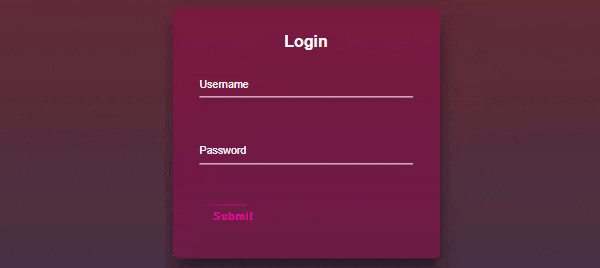
A login page is a web page that provides a user interface for individuals to authenticate themselves and gain access to a specific system or application. It typically consists of a form where users can enter their credentials, such as a username and password, to verify their identity. In this post, I will share with you a pre-designed login page template with an animated submit button. I will provide you with the complete source code so that you can customize the design based on your requirements.
Please note that this post is only for the design purpose, for form validation, you can check our login form validation and registration from the validation post.
👉👉 Five Login Registration Form Example 👈👈
- Login Registration Template With Google And Facebook Buttons
- Login Registration Template With Password Show Hide Feature
- Toggle Login And Registration Form In HTML CSS And JavaScript
- Login Page Template Design With Particle JS Animation
- HTML CSS Login Page Template With Animated Label And Submit Button
HTML Structure of Login Page
You already know about the login page. Typically a login page consists of a username and password field. Hence to create a login page template we need to take two input fields one is for username and another one is for password. We will also use some label tags to indicate the input fields.
< div class="loginBox">
    < h2>Login< /h2>
    < form action="#">
        < div class="userInputBox">
            < input type="text" id="usernameInputBox" required>
            < Label for="usernameInputBox">Username< /Label>
        < /div>

        < div class="userInputBox">
            < input type="password" id="passwordInputBox" required>
            < Label for="passwordInputBox">Password< /Label>
        < /div>
        < a href="#" type="submit">
            < !-- span tag for button animation -->
            < span>< /span>
            < span>< /span>
            < span>< /span>
            < span>< /span>
            Submit
        < /a>
    < /form>
< /div>
Explanation of the above code block
Login Box: The < div > with class "loginBox" contains the login form.
Username Input: There's an input field for the username (< input type="text" >) and a label "Username" associated with it.
Password Input: Another input field for the password (< input type="password" >) with a label "Password".
Submit Button: Styled like a button using an < a > tag, but it's not ideal. It has the text "Submit".
Please note that this is just an example, you can download the complete source code for here.
Create Animated Label
As you already know we will create some animation effects for our login form. So now in this section, we will apply an animation effect to the label of the login form. Our plan is initially will keep the label in the middle of the input box and when the user clicks on the input box we will move the label up slowly.
.userInputBox{
    position: relative;
    margin-bottom: 30px;
}

.userInputBox label{
    position: absolute;
    top: 0;
    left: 0;
    padding: 10px 0;
    font-size: 16px;
    color: #fff;
    pointer-events: none;
    transition: .5s;
}

.userInputBox input{
    width: 100%;
    background: transparent;
    outline: none;
    border: 0;
    color: #fff;
    border-bottom: 1px solid #fff;
    padding: 10px 0;
    margin-bottom: 30px;
    font-size: 16px;
}

.userInputBox input:focus ~ label,
.userInputBox input:valid ~ label{
    top: -20px;
    font-size: 12px;
    color: #f403af;
}
The main idea behind this code is to create a stylish effect for labels in the `.userInputBox` container when the associated input field is focused or has a valid value. It achieves this by using CSS positioning and transitions.
The result is that when the user clicks or focuses on the input field, the label smoothly moves up and becomes smaller, creating a visually appealing effect. This design helps to indicate to the user which input field they are interacting with and provides a pleasant user experience. Additionally, if the input field has a valid value, the label will also move up and change color, reinforcing the user's input.
Please note that this is just an example, you can download the complete source code for here.
Create Animated button
In this section, we will create an animation for our submit button. We will create a border-moving animation effect.
.loginBox a{
    position: relative;
    color: #f403af;
    display: inline-block;
    text-decoration: none;
    font-size: 16px;
    letter-spacing: 2px;
    padding: 10px 20px;
    border: 0;
    overflow: hidden;
    border-radius: 5px;
    transition: .5s;
}
.loginBox a span{
    position: absolute;
}

.loginBox a span:nth-child(1){
    top: 0;
    left: -100%;
    height: 2px;
    width: 100%;
    background: linear-gradient(90deg, transparent, #f403af);
    animation: toplineAnimation 1s linear infinite;
}

@keyframes toplineAnimation{
    0%{
        left: -100%;
    }
    50%,100%{
        left: 100%;
    }
}

.loginBox a span:nth-child(2){
    top: -100%;
    right:0 ;
    height: 100%;
    width: 2px;
    background: linear-gradient(180deg, transparent, #f403af);
    animation: rightlineAnimation 1s linear infinite;
    animation-delay: .25s;
}

@keyframes rightlineAnimation{
    0%{
        top: -100%;
    }
    50%,100%{
        top: 100%;
    }
}

.loginBox a span:nth-child(3){
    right: -100%;
    bottom:0 ;
    height: 2px;
    width: 100%;
    background: linear-gradient(270deg, transparent, #f403af);
    animation: bottomlineAnimation 1s linear infinite;
    animation-delay: .5s;
}

@keyframes bottomlineAnimation{
    0%{
        right: -100%;
    }
    50%,100%{
        right: 100%;
    }
}

.loginBox a span:nth-child(4){
    bottom: -100%;
    left:0 ;
    height: 100%;
    width: 2px;
    background: linear-gradient(360deg, transparent, #f403af);
    animation: leftlineAnimation 1s linear infinite;
    animation-delay: .75s;
}

@keyframes leftlineAnimation{
    0%{
        bottom: -100%;
    }
    50%,100%{
        bottom: 100%;
    }
}
The main idea behind this code is to create an animated border effect around the `< a >` element inside the `.loginBox` container. This effect gives the impression of a moving border around the button.
The result is that each line animates independently to create a continuously moving border around the button, giving it a visually appealing and dynamic appearance.
Please note that this is just an example, you can download the complete source code for here.
In conclusion, the login page template with the animated label and button provides an engaging and visually appealing user interface for a login form. The combination of the animated button border and the label animation enhances the overall user experience and adds a touch of modern design.
The label animation in the input fields creates an intuitive interaction for users by dynamically moving the labels above the input fields when they are focused or have valid input. This visual cue helps users easily identify the associated input field and provides a smooth transition as they enter their credentials.
The animated button border adds a sense of dynamism and sophistication to the login form. The border lines move around the button in a continuous loop, giving it an eye-catching and interactive effect. The use of CSS animations and gradients provides a seamless transition between different states, resulting in a visually pleasing button design.
Overall, this login page template demonstrates the creative possibilities that can be achieved with HTML and CSS. By incorporating animated elements, the template not only enhances the aesthetics of the login page but also improves the user experience by guiding users and capturing their attention.
Still you face problems, feel free to contact with me, I will try my best to help you.

Kamrul Hasan
Like to learn and share programming skills(HTML, CSS, Bootstrap, javaScript, C#, SQL).