

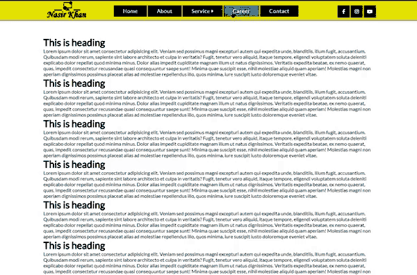
Responsive Dropdown Menu with Submenu in HTML CSS & JS
Last Updated: 2024-04-26 08:28:52
A responsive dropdown menu with a submenu can be created using HTML, CSS, and JavaScript. The HTML would consist of a top-level navigation menu with dropdown buttons for each menu item that has a submenu. The CSS would style the menu and make it responsive, while the JavaScript would handle the functionality of the dropdown and submenu.
What is Responsive Dropdown Menu?
A responsive dropdown menu is a navigation menu that adapts to the size of the screen or device it is being viewed on. It uses CSS media queries to change the layout and styles of the menu based on the viewport size, allowing for a seamless user experience across different devices.
For example, on a large desktop screen, the menu might be displayed as a horizontal bar across the top of the page. On a smaller mobile device, it might be displayed as a vertical menu that can be accessed by tapping a button
Responsive dropdown menus are important because they ensure that users can easily navigate your website, regardless of their device. They are especially useful in today's world where people access the internet on a wide variety of devices, including smartphones, tablets, and laptops with different screen sizes.
What is Submenu in the Dropdown menu?
A submenu is a secondary menu that is nested within a primary menu. It is typically triggered by user interaction, such as hovering over a menu item or clicking on a dropdown button. Submenus are typically used to organize related items and provide additional navigation options within a website or application.
For example, a main menu might have a "Services" item that, when clicked on, opens a submenu displaying a list of specific services offered by a company such as "Design", "Development", "Consulting" etc.
Submenus can be implemented using HTML and CSS to create the structure and layout of the menu, and JavaScript to handle the functionality of the submenu, such as showing and hiding it when the user interacts with the menu.
It is important to keep the design and functionality of the submenu simple and intuitive to avoid confusing the users.
What is the Hamburger menu?
A hamburger menu is a button typically placed in a top corner of a website or application that, when clicked or tapped, opens a navigation menu. It gets its name from its appearance which is similar to a hamburger. It is often used as a substitute for a traditional website navigation, particularly on mobile devices where screen space is limited.
The hamburger menu icon usually consists of three horizontal lines, stacked on top of each other. When the icon is clicked, the navigation menu will slide in or slide out from the left or right side of the screen, and the icon will change to an "X" to indicate that the menu is open.
Hamburger menus are popular because they take up minimal screen space and allow for a clean, uncluttered design. They are also convenient for mobile users as they can easily access the navigation menu without having to scroll to the top of the page. Hamburger menu is also often combined with the responsive dropdown menu to create a user-friendly navigation experience on different devices.

Create a Responsive Dropdown Menu with Submenu in HTML, CSS & JavaScript
A responsive dropdown menu with a submenu is a navigation menu that adjusts its layout and functionality based on the screen size of the device it is being viewed on. It is typically created using HTML, CSS, and JavaScript.
In HTML, the menu is structured using a nav element and a nested unordered list for the main menu items and submenu items. In CSS, the menu is styled to be horizontally aligned, with submenu items hidden by default and shown when the user hovers over the main menu item. Media queries are also used to change the layout of the menu when the screen size is below a certain width.
In JavaScript, a toggle function is used to make the menu responsive by showing and hiding the menu items when the screen size is below a certain width. The function is triggered by a button that is added to the menu when the screen size is below a certain width.
< nav>
  < ul>
    < li>< a href="#">Home< /a>< /li>
    < li>
      < a href="#">Services< /a>
      < ul>
        < li>< a href="#">Design< /li>
        < li>< a href="#">Development< /a>< /li>
        < li>< a href="#">Consulting< /a>< /li>
      < /ul>
    < /li>
    < li>< a href="#">About< /a>< /li>
    < li>< a href="#">Contact< /a>< /li>
  < /ul>
< /nav>
This is the HTML markup for the navigation menu. It creates a nav element that contains an unordered list (ul) with four list items (li). Each list item contains an anchor element (a) that represents a link to a different page. The "Services" list item also has an additional unordered list inside it, which represents the submenu.
Please note that this is an example source code you can download the main full source code from here.
nav {
  display: flex;
  justify-content: center;
}
ul {
  list-style: none;
  display: flex;
  align-items: center;
}
li {
  position: relative;
}
li ul {
  position: absolute;
  display: none;
}
li:hover ul {
  display: block;
}
@media only screen and (max-width: 600px) {
  nav {
    display: none;
  }

  .menu-btn {
    display: block;
    background-color: #333;
    color: #fff;
    padding: 10px;
    text-align: center;
    cursor: pointer;
  }

  .show-menu {
    display: block;
  }
}
This is the CSS that styles the menu. The first part of the CSS sets the nav element to display as a flex container, with its contents aligned to the center. It also removes the bullet points from the ul element, and sets the li elements to be relative positioned.
The second part of the CSS hides the submenu by default, and then makes it visible when the user hovers over the "Services" list item.
The third part of the CSS uses a media query to detect when the screen width is less than 600px, and when it is, it hides the nav element and shows a button with a class of .menu-btn. This button will be used to toggle the visibility of the nav element when clicked.
Please note that this is an example source code you can download the main full source code from here.
let menuBtn = document.querySelector('.menu-btn');
let nav = document.querySelector('nav');
menuBtn.addEventListener('click', function() {
  nav.classList.toggle('show-menu');
});
This is the JavaScript code that makes the menu responsive. It uses the querySelector method to select the .menu-btn and nav elements and then adds a click event listener to the .menu-btn. When the button is clicked, the code toggles the show-menu class on the nav element, which makes the dropdown effect. This code creates a basic navigation menu with a "Services" item that, when hovered over, displays a submenu with "Design", "Development", and "Consulting" options. The media query is used to hide the menu on smaller screens and replace it with a hamburger icon that when clicked will toggle to show the menu.
Please note that this is a very basic example, and you may want to add more features or styles to make it more polished, You can also download the main full source code from here.
Importance of Responsive Menu Bar
Responsive menus are needed for several reasons:
To provide a consistent user experience: A responsive menu ensures that users have the same level of access to navigation options regardless of the device they are using. It adapts the layout and styles of the menu to the viewport size, making it easy for users to navigate the website on any device.
- To improve accessibility: A responsive menu makes it easier for users with disabilities to navigate a website. It can be designed to be keyboard-navigable and optimized for screen readers, making it more accessible for users with visual or motor impairments.
- To increase user engagement: A responsive menu helps users find what they are looking for quickly and easily. It allows users to easily access different sections of a website, improving the overall user experience.
- To improve SEO: Search engines like Google prefer mobile-friendly websites. A responsive menu ensures that the website is optimized for different devices and screen sizes, making it more likely to be indexed by search engines.
- To save development time: A responsive menu eliminates the need to design and develop separate versions of a website for different devices, saving development time and resources.
Overall, a responsive menu is an essential part of creating a user-friendly, accessible, and mobile-friendly website that can adapt to different devices and screen sizes.
Best Practice of Creating a Responsive Menu Bar
Here are some best practices for creating a responsive menu:
- Keep the menu simple and intuitive: Use a clear and simple structure for the menu, with items organized into logical categories. Avoid using too many nested submenus, as this can make the menu confusing and difficult to use.
- Use a hamburger icon: On smaller screens, use a hamburger icon to represent the menu. This icon should be clearly visible and easy to tap or click on.
- Make the menu keyboard-navigable: Ensure that users can navigate the menu using keyboard shortcuts, such as the Tab key. This is particularly important for users with motor impairments.
- Optimize for touch: On touch devices, make sure the menu items are large enough to be easily tapped and that there is sufficient space between items to prevent accidental taps.
- Test on different devices: Test the menu on a variety of devices and screen sizes to ensure it looks and works as expected. This will help identify any issues and ensure that the menu is fully responsive.
- Use CSS media queries: Use CSS media queries to change the layout and styles of the menu based on the viewport size. This allows for a seamless user experience across different devices.
- Use JavaScript to handle the functionality of the menu: Use JavaScript to handle the functionality of the menu, such as showing and hiding it when the user interacts with the menu.
- Consider accessibility: Make sure your menu is accessible for all users, including those with disabilities. It should be designed to be keyboard-navigable, optimized for screen readers, and include appropriate ARIA attributes
By following these best practices, you can create a responsive menu that is easy to use, accessible, and adapts to different devices and screen sizes.
Overall, creating a responsive dropdown menu with submenu in HTML, CSS and JavaScript allows the menu to be easily accessible and user-friendly on all devices, while providing a consistent experience for users.
Still you face problems, feel free to contact with me, I will try my best to help you.