

How to Rotate a Circle - JavaScript Animation
Last Updated: 2023-06-14 19:23:04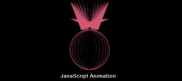
In this tutorial, we will explore how to create an eye-catching rotating circle effect using HTML, CSS, and JavaScript. This effect combines creative styling, CSS animations, and JavaScript interactions to produce a visually engaging result. Let's dive into the code and learn how it works.
JavaScript Projects For Beginners With Source Code
Developing a simple JavaScript project is one of the best ways to learn javascript for a beginner. Hence if you are a beginner in javascript we are suggesting you develop some simple projects using the basic functionality of javascript. Here are some simple javascript projects for beginners with source code. Go through each link and read the technique. Also, if you want you can download the complete source code.
- Javascript Tip calculator
- Javascript Temperature Converter
- Javascript Length Converter
- Javascript Percentage Calculator
- Javascript Fraction Calculator
- Javascript BMI Calculator
- Javascript Speed Calculator
- Javascript Online Stopwatch Full Screen
- Javascript Online Timer
- Javascript Online Digital Clock
HTML Structure
< div class="circle" id="MainCircle">< /div>The HTML part consists of a single < div> element with the class "circle" and the id "MainCircle." This element serves as the container for our rotating circle animation.
CSS Styling
*{
    -webkit-box-sizing: border-box;
    -moz-box-sizing: border-box;
    box-sizing: border-box;
}
body{
    background-color:#000;
    overflow: hidden;
    height:100vh;
    position:relative;
    -webkit-perspective: 2000px;
    perspective: 2000px;
}
.circle{
    width:200px;
    height:200px;
    position:absolute;
    top: 50%;
    left: 50%;
    margin-left: -100px;
    margin-top: -100px;
    -webkit-transform-style:preserve-3d;
            transform-style:preserve-3d;
    -webkit-animation:CircleRotate 5s linear 0s infinite;
            animation:CircleRotate 5s linear 0s infinite;
}


@-webkit-keyframes CircleRotate{
    0%{
      -webkit-transform:rotatey(0deg);
              transform:rotatey(0deg);
    }
    50%{
      -webkit-transform:rotatey(180deg);
              transform:rotatey(180deg);
    }
    100%{
      -webkit-transform:rotatey(360deg);
              transform:rotatey(360deg);
    }
}


@keyframes CircleRotate{
    0%{
      -webkit-transform:rotatey(0deg);
              transform:rotatey(0deg);
    }
    50%{
      -webkit-transform:rotatey(180deg);
              transform:rotatey(180deg);
    }
    100%{
      -webkit-transform:rotatey(360deg);
              transform:rotatey(360deg);
    }
}

.circle div{
  position:absolute;
  width:200px;
  height:200px;
  border-radius:50%;
  border:2px dashed rgba(120,120,120,.3);
  border-top:2px dashed rgba(0,0,0,0);
}

.circle div:before{
      content: "";
      position: absolute;
      top: 0;
      left: 50%;
      -webkit-transform:translate(-50% , -108%);
      -ms-transform:translate(-50% , -108%);
          transform:translate(-50% , -108%);
      border-width: 20px;
      border-style: solid;
      border-color: inherit;
      border-left: 90px solid rgba(0, 0, 0, 0);
      border-top: 90px solid rgba(0, 0, 0, 0);
      width: 0;
      height: 0;
      -webkit-animation:psudoRotate 2s linear 0s infinite alternate ;
      animation:psudoRotate 2s linear 0s infinite alternate;
}

@-webkit-keyframes psudoRotate{
    0%{
    -webkit-transform:translate(-50% , -100%) rotate(0deg) scale(.4);
            transform:translate(-50% , -100%) rotate(0deg) scale(.4);
    }
    100%{
    -webkit-transform:translate(-50% , -140%) rotate(70deg) scale(1.4);
            transform:translate(-50% , -140%) rotate(70deg) scale(1.4);
    }
}

@keyframes psudoRotate{
    0%{
    -webkit-transform:translate(-50% , -100%) rotate(0deg) scale(.4);
            transform:translate(-50% , -100%) rotate(0deg) scale(.4);
    }
    100%{
    -webkit-transform:translate(-50% , -140%) rotate(70deg) scale(1.4);
            transform:translate(-50% , -140%) rotate(70deg) scale(1.4);
    }
}
To ensure proper box sizing, we use the universal selector * and apply the box-sizing property with a value of border-box. This property includes padding and border within the specified width and height of elements.
The body element is styled to set the background color to black (#000) and make it full-height (100vh). Additionally, we set the overflow property to hidden to prevent any scrolling and apply a 3D perspective effect to the entire page using -webkit-perspective and perspective properties.
The .circle class defines the styles for the rotating circle itself. It has a width and height of 200 pixels, and its position is set to absolute to allow proper positioning. The top and left properties, combined with negative margins, center the circle in the middle of the page.
To create the rotating effect, we utilize CSS transforms. The transform-style property is set to preserve-3d to maintain the 3D space during the animation. The @keyframes rule is used to define the CircleRotate animation, which rotates the circle around the y-axis from 0 to 360 degrees over a duration of 5 seconds. This animation is then applied to the circle using the animation property.
The .circle div selector targets the individual div elements within the circle. These divs create the dashed circular border of the rotating circle. They have absolute positioning, a width and height of 200 pixels (matching the circle), and a border-radius of 50% to create a circular shape. The border property defines a dashed border style with a specified color and transparency.
The before pseudo-element is used to create a triangular shape within each div. It is positioned absolutely at the top of the div, and its appearance is customized using border properties. The psudoRotate animation is applied to this pseudo-element, causing it to rotate and scale alternately between two states.
JavaScript Functionality
var MainCircle = document.getElementById("MainCircle");

function rndColor(max) {
  var rd = [4, 5, 6, 3];
  var rgba =
    "rgba(" +
    Math.floor(Math.random() * max) +
    "," +
    Math.floor(Math.random() * max) +
    "," +
    Math.floor(Math.random() * max) +
    ",." +
    rd[Math.floor(Math.random() * rd.length)] +
    ")";

  return rgba;
}

window.onload = function (e) {
  "use strict";
  var colors = rndColor(255);

  for (var i = 0; i < 30; i++) {
    var child = document.createElement("div");
    child.style.transform = "rotatey(" + (360 / 30) * i + "deg)";
    child.style.borderColor = colors;
    MainCircle.appendChild(child);
  }
};

function changeColor() {
  var x = rndColor(220);
  for (var i = 0; i < MainCircle.children.length; i++) {
    MainCircle.children[i].style.borderColor = x;
  }
}

setInterval(changeColor, 1000);
The JavaScript part of the code enhances the animation by dynamically changing the colors of the circle's div elements. The rndColor function generates a random RGB color with a maximum value specified as a parameter. The function also includes some randomness in the transparency value.
When the window loads, the window.onload event handler executes the code inside its callback function. It generates 30 div elements representing the dashed borders of the circle. Each div is rotated around the y-axis using the rotatey CSS transform property and assigned a random border color.
The changeColor function is called repeatedly at an interval of 1 second using setInterval. It generates a new random color and updates the border color of each div element within the circle.
In this blog post, we explored a fascinating source code that creates a visually appealing rotating circle animation using HTML, CSS, and JavaScript. By combining CSS transforms, animations, and JavaScript color manipulation, we achieved a dynamic and captivating effect. Understanding the different components of this code will empower you to create your own engaging animations and enhance the visual appeal of your web projects.
Still you face problems, feel free to contact with me, I will try my best to help you.