

CSS Animation Examples With Source Code | 3D Rotating Image Gallery
Last Updated: 2025-08-16 06:40:17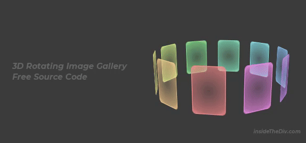
If you’re looking for creative CSS animation examples with source code, this 3D rotating image gallery is a perfect project to try. In this guide, we’ll build a responsive image gallery HTML CSS layout that uses 3D rotation CSS, 3D transformation CSS, and perspective in CSS example to create a stunning spinning carousel effect.
This project is a great example for anyone searching for CSS image gallery grid, CSS image gallery examples, or even CSS image gallery slider designs. You’ll also pick up tips for responsive background image CSS, background image transparency CSS, and CSS image as background cover so your design works beautifully on any screen size.
Download the complete source code from here and start customizing your own CSS 3D images gallery download or even share it as a 3D images gallery online free project.
You can also try the following project to practice CSS animation.
Source Code Explanation
The heart of this design is the .inner container, which uses transform-style: preserve-3d and @keyframes to rotate all .card elements in 3D space. Each .card gets a unique rotation using the --index variable, giving it a perfect circular arrangement.
The perspective in CSS is applied to the .wrapper, creating the depth effect that makes the cards appear to pop out. A smooth radial gradient fills each card, and you can easily adjust transparency to learn how to make an image transparent or set a background image in CSS no repeat.
/* Card — each individual colored panel in the 3D carousel */
.card {
	position: absolute;
	width: var(--card-width);
	height: var(--card-height);
	border-radius: 12px;
	border: 2px solid;
	overflow: hidden;
	top: 0;
	left: 0;
	--index: 0;
	--color-r: 0;
	--color-g: 0;
	--color-b: 0;
	transform:
	rotateY(calc((360deg / var(--cards-count)) * var(--index)))
	translateZ(calc((var(--card-width) + var(--card-height))));
	border-color: rgb(var(--color-r), var(--color-g), var(--color-b));
}
/* Img — fills the card with a smooth radial gradient */
.img {
	width: 100%;
	height: 100%;
	background: radial-gradient(
	circle,
	rgba(var(--color-r), var(--color-g), var(--color-b), 0.2) 0%,
	rgba(var(--color-r), var(--color-g), var(--color-b), 0.6) 80%,
	rgba(var(--color-r), var(--color-g), var(--color-b), 0.9) 100%
	);
}
Final Suggestions
- To recreate this CSS animation examples with source code:
- Use CSS variables (
--index,--color) for easy customization. - Apply
perspectiveon the outer container for realistic depth. - Rotate elements with
transform: rotateY()for a smooth circular gallery. - Adjust transparency and gradients for creative background effects.
- Watch the video tutorial for step-by-step guidance.
With this method, you can create your own CSS image gallery for portfolios, product showcases, or personal projects.
Still you face problems, feel free to contact with me, I will try my best to help you.