

CSS 3D Button with Box-Shadow Example-01
Last Updated: 2025-09-02 14:13:07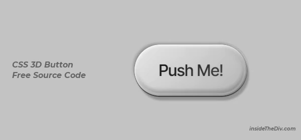
In this blog post, we’re diving into one of the most powerful CSS properties: box-shadow. We’ll break down how to use it to create a stunning 3D glass button complete with realistic hover effects and animations. This tutorial is perfect for USA students and beginners looking to level up their CSS button design skills. By the end, you'll understand advanced CSS box shadow examples and be able to download the source code to use in your own projects.
You can download the full source code from the link below to see all these css box shadow examples in action.
Source Code Explanation
.button-inner {
    /* Inner button surface */
    --inset: 0.035em;
    position: relative;
    border-radius: inherit;
    padding: 1em 1.5em;
    background: linear-gradient(135deg, var(--bg-light), var(--bg-dark));
    clip-path: inset(0 round 999vw);
    transition: box-shadow 0.3s ease, clip-path 0.25s ease, background 0.25s ease, transform 0.25s ease;
    box-shadow:
        0 0 0 0 inset rgba(5, 5, 5, 0.1),
        -0.05em -0.05em 0.05em 0 inset var(--shadow-dark),
        0 0 0.05em 0.2em inset var(--shadow-light),
        0.025em 0.05em 0.1em 0 inset #fff,
        0.12em 0.12em 0.12em inset var(--shadow-light),
        -0.075em -0.25em 0.25em 0.1em inset var(--shadow-dark);
}

button:hover .button-inner {
    /* Hover effect for depth */
    clip-path: inset(0.0625em round 999vw);
    box-shadow:
        0.1em 0.15em 0.05em 0 inset var(--shadow-strong),
        -0.025em -0.03em 0.05em 0.025em inset rgba(5, 5, 5, 0.5),
        0.25em 0.25em 0.2em 0 inset rgba(5, 5, 5, 0.5),
        0 0 0.05em 0.5em inset rgba(255, 255, 255, 0.15),
        0.12em 0.12em 0.12em inset var(--shadow-light),
        -0.075em -0.12em 0.2em 0.1em inset var(--shadow-dark);
}

.button-inner span {
    /* Button text with gradient */
    position: relative;
    z-index: 4;
    font-family: "Inter", sans-serif;
    letter-spacing: -0.05em;
    font-weight: 500;
    background: linear-gradient(135deg, rgb(25, 25, 25), rgb(75, 75, 75));
    background-clip: text;
    color: transparent;
    transition: transform 0.25s ease;
    text-shadow: rgba(0, 0, 0, 0.1) 0 0 0.1em;
    user-select: none;
}- The magic of this button css style example lies in using multiple, layered
box-shadowvalues to create depth and realism. Here are the key parts: - Layered Shadows: The
.button-innerclass uses multiple shadows—both outer andinset—to simulate light sources and depth, creating the 3D effect. - Smooth Animation: CSS
transitionproperties on the.button-innerensure the hover animation is smooth and visually appealing. - The Pressed Effect: On hover, the
clip-pathproperty changes to make the button look like it's being pressed inward, enhancing the 3D illusion. - CSS Variables: Colors and shadow values are stored in
:rootvariables, making the design easy to customize.
You can download the full source code from the link below to see all these css box shadow examples in action.
Final Suggestion
- To successfully create this CSS button hover animation, keep these tips in mind:
- Experiment with the
blurandspreadvalues in yourbox-shadowto see how they affect the softness and size of the shadow. - Use the
insetkeyword for shadows to create inner depth instead of outer glows. - Layer multiple shadows (separated by commas) to build complexity and realism.
- Watch the video tutorial for a visual, step-by-step guide that makes these concepts even easier to understand.
Still you face problems, feel free to contact with me, I will try my best to help you.