
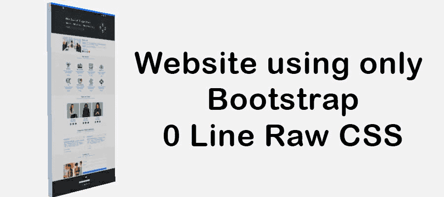
Create a Responsive website using only bootstrap 5
- Last Updated : 7/07/2021
You may already know what is Bootstrap and how can you use it. But now the question is can we build a website using only bootstrap without any raw CSS or JavaScript. the answer is yes, using the only Bootstrap we can create a complete Responsive website.
In this post, I will share with you or provide you a complete guideline to build a Responsive website using only Bootstrap 5.
we know bootstrap Framework contains a lot of things but to build a simple complete website we do not need all of this, so let's decide first which things or which technique of bootstrap we will use in this tutorial.
We will use
- ✅ Bootstrap layout system to make our site responsive.
- ✅ Bootstrap navigation system with dropdown.
- ✅ Bootstrap carousel slider.
- ✅ Bootstrap card design.
- ✅ Bootstrap input field design that means contact form.
- ✅ Bootstrap accordion.
- ✅ Bootstrap modal box.
list of sections or features of our website
Before start building our website let’s discuss about the number of section or features we will create or build in our website. On our computer website, we will build 8 sections.
- 👉 Head section.
- 👉 About section.
- 👉 Service section.
- 👉 Team section.
- 👉 Feedback section.
- 👉 Frequently asked questions action section.
- 👉 Contact action section.
- 👉 Footer action section.
Header Section Design
The header section is one of the main parts of any website because in this part we keep our navigation or our slogan. and that's why we will divide the header section into 3 parts.
- Top section
- Navigation section
- And slider section
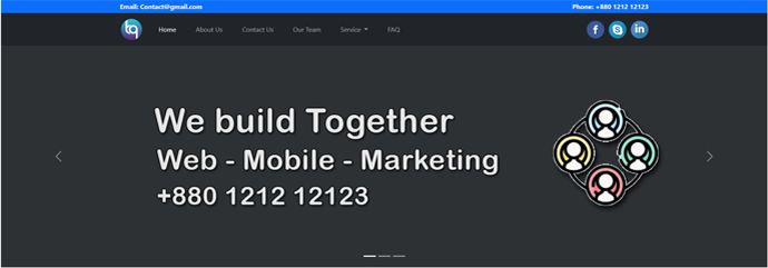
Top Section
In the heading top section, you will keep two information one is our email address and another one is our phone number. so we can divide the section into two parts one is the left part for your email address and another n is it right part for our phone number.
So the idea is we will take a row and we will divide this into two-column. To make this section responsive we will use the call-12 class so that each column takes full width on our mobile device.
Navigation part
The bootstrap navigation system is already responsive so to use this navigation system will just need to customize the navigation.
Now for this website, you will use our brand or logo on the left side and we will keep our navigation link to the center and our social icon to the right side. we will also use the dropdown button.
You already know that our website will be a single-page application that's why our navigation link should contain the section ID as a target.
Slider Section
To build our slider section we will use the bootstrap carousel slider system this is not so hard things you just need to copy the whole code from the bootstrap documentation then use our image as a slider also we need to change or use our own id as a target.
About Section Desing
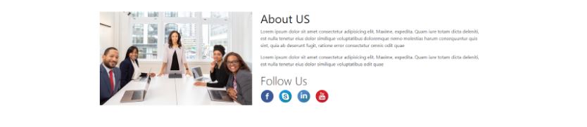
On the about section, we will keep company details as about text and an image with some social-media links. So we can divide our about section into two columns for computer devices using the call-lg-5 and col-lg-7 classes. And on our left column, we will use keep an image and on our right column we will keep our about details and title and social-meadia links icons.
We will also use the call-12 class in each column so that each column take 100% width on a mobile device.
Also to make our title beautiful we will use the bootstrap display-6 class.
Service Section Desing
-07-07-2021-10-27-47am.jpg)
In our service section, we will show our all services like web design development every search acceptor using the bootstrap card.
Here we have its services so show in each row we will show four services that means you will take Aero and you will divide this row into 4 columns using call LG E3 Plus. we will also college 12 class in each column so that it services take 100% wide in mobile devices to make the section responsive
In our every card we will show an icon or image then our title of the service than a short description and a quotation button.
To get a quotation when someone clicks on the button we will show a modal that means bootstrap modal and inside the modal, you will design a contact form so that anyone can fulfill the contact form and submit it to get a quote.
Note: We can keep our models code in any place inside the HTML tag, in this case, we will keep for model code just at the bottom of the HTML tag.
Team Section Desing
-07-07-2021-10-26-48am.jpg)
To build a team section using bootstrap we will use the bootstrap card again and in this case, we will show our 3 team members so we will take a row and then divide this row into three columns and each column will contain a card to display the image, name, profession, and social icon of our team member.
Feedback Section Desing
-07-07-2021-10-27-17am.jpg)
To build a responsive feedbacks showing system using bootstrap you will use bootstrap quotation design. also, we will use the text-center class so that our quotation image and name of the client take place in the center of the row.
Frequently Asked Question(FAQ) section Design
-07-07-2021-10-27-23am.jpg)
FAQ section or frequently asked questions section is one of the common features of every website. This project or in this website will also create a frequently asked question using the bootstrap accordion.
Bootstrap accordion is not so hard thing but if we use multiple bootstrap accordions on the same page then it is tricky because we need to change the targeted ID of every accordion.
Contact us section Design
-07-07-2021-10-27-34am.jpg)
We will design our contact us section just like our about us section. we will take a row and divide it into two parts (col-lg-5 and col-lg-7) one is for our image and another is for our contact form and insert the contact form column we will use the Bootstrap input field, To give some information to our input field’s placeholder you will use floating form design.
Footer Section Design
-07-07-2021-10-27-40am.jpg)
In this section we will take 3 rows and every row will contain a single column so that we can easily Centre is item and insert the three-row the first row will take a button so that by clicking this button you can easily go to the top then the second row will take simply a contact form For our newsletter. Then the last row will take some social icons so that anyone can follow us.
Still you face problems, feel free to contact with me, I will try my best to help you.