

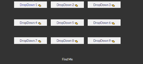
Animated dropdown buttons with source code
- Last Updated : 03/10/2021
Dropdown buttons or dropdown menu is one of the most important things in every website, especially on e-commerce websites to show categories and subcategories we need dropdown buttons. In this post, we will create nine(9) animated dropdown buttons using only HTML and CSS. Also, I will provide you the complete source code.
What is the dropdown buttons?
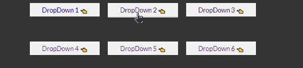
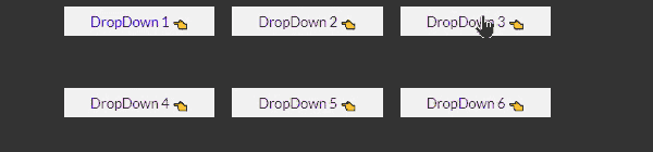
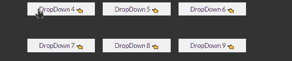
Dropdown buttons are actually the representation of the parent-child relationship.
At the bigging, the parent button will be shown and when we click on the parent or
hover on the parent all child buttons will be shown.
Suppose a website provides three services (web design,
web development, and SEO) in this case the parent category is ‘service’
and under the ‘service’ category we can show our three services.
Now at the very bigging, only the ‘service’ would show, and when we click
on the service or hover on the ‘service’ then our three categories will show.
HTML structure for dropdown button.
To create a dropdown button first you need a parent element and inside the parent element,
you need to keep all the child elements.
Note: if you don’t keep your child element inside the parent element the CSS hover effect will not work.
So if you want to create the dropdown button with CSS hover hove effect please keep your child button inside the parent button.
Example of HTML structure for dropdown button
<parent>
    Parent Button Text
    <childs>
        Child 1
        Child 2
        Child 3
    </childs>
</parent>
<ul class="dropdown dropdown-2">
    <li class="parent"> <!-- parent -->
        <a href="">DropDown 2 <span>👈</span></a> <!-- parent text -->
        <ul class="childs"> <!-- childs -->
            <li><a href="">- Service</a></li> <!-- single child -->
            <li><a href="">- About Us</a></li> <!-- single child -->
            <li><a href="">- Contact</a></li> <!-- single child -->
        </ul>
    </li>
</ul>
Note: here I used unorder list, but you can use a div tag also. Also, I used HTML emoji for indication you can any icon.
CSS Tricks for dropdown buttons
To create a dropdown button using CSS we need to use the CSS hover effect. The main trick is, we will keep hiding the children’s elements first and when we hover on our parent element we will show all the children.
.childs{
    display:none;
}
.parent:hover .childs{
    display:block;
}
.dropdown{
    display: inline-block;
    margin: 10px;
}
.parent{
    display: block;
}
.parent > a{
    display: block;
    background-color: #f1f1f1;
    box-sizing: border-box;
    padding: 7px 30px;
}
.dropdown .parent a span{
    display: inline-block;
    transition:0.4s;
    font-size: 14px;
}
    /*for icon rotation*/
.dropdown .parent:hover > a span{
    transform:rotate(-90deg);
}
.childs{
    background-color: #d3d3d3;
}
.childs li{
    display: block;
    border-bottom: 1px solid #f1f1f1;
}
.childs li a{
    display: block;
    box-sizing: border-box;
    padding: 7px 30px;
}
/*main effect*/
.dropdown-1 .childs{
    display: none;
}
.dropdown-1 .parent:hover > .childs{
    display: block;
}
Basic Tips to create animated dropdown buttons.
- ✅ For Animation, we need CSS transition property.
- ✅ Here we use display property to show and hide child elements, but you can use height and with to show and hide.
- ✅ CSS transition property does not work when we use display none and display block so for animation try to use CSS position property technically to hide and show.
- ✅ Using CSS position property is the best practice.
- ✅ Remember using height or width is not the best practice.
- ✅ CSS transition property does not work when we use height auto.
- ✅ CSS transition property does not work on span element that’s what we make our icon display inline-block.
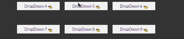
9 Easy DropDown Buttons with source code
- 🎯 Basic DropDown Button.
- 🎯 Height Expand Animated dropdown button
- 🎯 Width Expand Animated dropdown button
- 🎯 Slide Up Animated dropdown button
- 🎯 Slide Down Animated dropdown button
- 🎯 Rotating Animated dropdown button
- 🎯 Zoom-in zoom-out from left Animated dropdown button
- 🎯 Zoom-in zoom-out from the center Animated dropdown button
- 🎯 Zoom-in zoom-out from Right Animated dropdown button
Height Expand Animated dropdown button
First time hide child using height property and when hover uses a fixed height not auto. Also, make sure you use CSS overflow property for your child’s element.
.dropdown-2 .childs{
    height: 0px;
    transition: 0.4s;
    overflow: hidden;
}
.dropdown-2 .parent:hover .childs{
    height: 100px;
    transition:0.4s;
}
Width Expand Animated dropdown button
First time hide child using height and width property and when hover uses a fixed width and auto to hight. Also, make use you use CSS overflow property for your child’s element.
.dropdown-3 .childs{
    width: 0px;
    height: 0px;
    transition: 0.4s;
    overflow: hidden;
}
.dropdown-3 .parent:hover  .childs{
    width: 100%;
    height: auto;
}
Slide Up Animated dropdown button
This time we will use CSS position property to hide and show our child element. So to hide the child element using CSS position property we need to make it position absolute and position relative to the parent element. Make use you add overflow property to your parent element. Finally, use CSS top property with a large negative value and to show using top 100% after hover.
.dropdown-4 .parent{
    position: relative;
    overflow: hidden;
}
.dropdown-4 .childs{
    position: absolute;
    width: 100%;
    z-index: 1;
    top: -400%;
    left: 0;
    transition: 0.1s;
}
.dropdown-4 .parent:hover{
    overflow: visible;
}
.dropdown-4 .parent:hover  .childs{
    top: 100%;
}
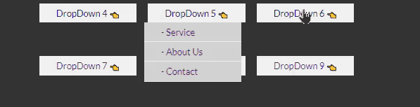
Slide Down Animated dropdown button
This is the same as slide up one just use large-top value to hide and use CSS top 100% to show when hover.
.dropdown-5 .parent{
    position: relative;
    overflow: hidden;
}
.dropdown-5 .childs{
    position: absolute;
    width: 100%;
    z-index: 1;
    top: 400%;  /*just changed*/
    left: 0;
    transition: 0.1s;
}
.dropdown-5 .parent:hover{
    overflow: visible;
}
.dropdown-5 .parent:hover  .childs{
    top: 100%;
}
Rotating Animated dropdown button
This one is also the same as the previous one, just to hide use a large CSS right positive value, and for rotation use the CSS transform rotate property
.dropdown-6 .parent{
    position: relative;
    overflow: hidden;
}
.dropdown-6 .childs{
    position: absolute;
    width: 100%;
    z-index: 1;
    top: 100%;
    right: 200px; /*just changed*/
    transition: 0.4s;
}
.dropdown-6 .parent:hover{
    overflow: visible;
}
.dropdown-6 .parent:hover  .childs{
    right: 0px; /*just changed*/
    transform: rotate(360deg); /*just changed*/
}
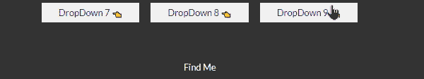
Zoom-in zoom-out from left Animated dropdown button
This one is also the same as the previous one, just to hide use the large CSS left negative value, and for zoom use, the CSS transform scale property.
.dropdown-7 .parent{
    position: relative;
    overflow: hidden;
}
.dropdown-7 .childs{
    position: absolute;
    width: 100%;
    z-index: 1;
    top: 100%;
    left: -100px; /*just changed*/
    transition: 0.4s;
    transform: scale(0); /*just changed*/
}
.dropdown-7 .parent:hover{
    overflow: visible;
}
.dropdown-7 .parent:hover  .childs{
    left: 0px; /*just changed*/
    transform: scale(1); /*just changed*/
}
Zoom-in zoom-out from the center Animated dropdown button
This one is also the same as the previous one, just to hide and show use the CSS transform scale property.
.dropdown-8 .parent{
    position: relative;
}
.dropdown-8 .childs{
    position: absolute;
    width: 100%;
    z-index: 1;
    top: 100%;
    left: 0; /*just changed*/
    transition: 0.4s;
    transform: scale(0); /*just changed*/
}
.dropdown-8 .parent:hover  .childs{
    transform: scale(1); /*just changed*/
}
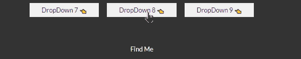
Zoom-in zoom-out from Right Animated dropdown button
This one is also the same as the previous one, just to hide use the large CSS right negative value, and for zoom use, the CSS transform scale property.
.dropdown-9 .parent{
    position: relative;
}
.dropdown-9 .childs{
    position: absolute;
    width: 100%;
    z-index: 1;
    top: 100%;
    right: -100px; /*just changed*/
    transition: 0.4s;
    transform: scale(0);
}
.dropdown-9 .parent:hover  .childs{
    right: 0px; /*just changed*/
    transform: scale(1);
}
Still you face problems, feel free to contact with me, I will try my best to help you.